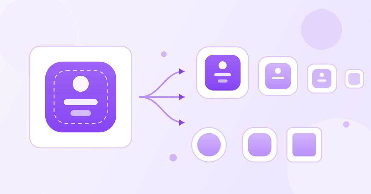
Android icon requirements look messier than they are. You need one 512×512 icon for the Play Store listing, a set of launcher icons at five pixel densities, and — since Android 8.0 — an adaptive icon built from two layers on a 108dp canvas. Get those three things right and your icon looks correct on every phone, from a budget device to a foldable.
This guide lists the exact pixel sizes, explains the safe zone that trips up most first-time submissions, and shows how to export the whole set from a single square image. If you just want the files, drop one high-resolution PNG into the App Icon Generator and it produces the Android density set (plus the iOS sizes) in one download — free, no sign-up, no watermark.
Start with one master image
Design once, export many. Your master should be a square PNG at 1024×1024 pixels. That is larger than anything Android needs, which is the point: downscaling stays sharp, upscaling never does. Use a transparent or deliberately coloured background, keep the artwork simple enough to read at 48 pixels, and avoid thin strokes and small text — at launcher size they turn to mush.
If your source art is a JPG or a WebP export from a design tool, convert it before you generate anything. A WebP to PNG converter keeps transparency intact, which matters for the foreground layer of an adaptive icon. If your master is not perfectly square, square it up first with the image cropper — a 1:1 crop now saves a stretched icon later.
Launcher icon sizes by density
Android does not ship one launcher icon. It ships the same icon at several pixel densities, and the system picks the one that matches the device screen. The baseline is 48dp; each density bucket multiplies that.
| Density bucket | Scale | Launcher icon (px) | Adaptive layer (px) |
|---|---|---|---|
| mdpi | 1× | 48 × 48 | 108 × 108 |
| hdpi | 1.5× | 72 × 72 | 162 × 162 |
| xhdpi | 2× | 96 × 96 | 216 × 216 |
| xxhdpi | 3× | 144 × 144 | 324 × 324 |
| xxxhdpi | 4× | 192 × 192 | 432 × 432 |
In an Android Studio project these land in res/mipmap-mdpi through res/mipmap-xxxhdpi. Use mipmap folders rather than drawable folders for launcher icons: mipmap resources survive density-specific APK stripping, so a launcher that requests a higher-density icon than the device screen still finds one.
Adaptive icons and the 72dp safe zone
Adaptive icons exist because manufacturers disagree about icon shape. Samsung uses a squircle, some launchers use a circle, others use a rounded square or a teardrop. Rather than shipping every shape, you ship two square layers — a background and a foreground — on a 108 × 108 dp canvas, and the system masks them into whatever shape the device wants.
The critical number is the safe zone: only the centre 72 × 72 dp is guaranteed to be visible. The outer 18dp on each side can be cropped away by the mask, and it is also the area the system animates during parallax and pulse effects. Anything important — a logo mark, a letterform, the subject of the artwork — must sit inside that centre square. This is the single most common reason an icon looks fine in a design file and clipped on a real phone.
- Background layer: usually a flat colour or a simple gradient that fills the entire 108dp canvas. No transparency, no detail near the edges.
- Foreground layer: your mark, centred, transparent around it, comfortably inside the 72dp safe zone.
- Legacy fallback: a plain square launcher icon at the density sizes above, for devices older than Android 8.0.
If you generate a padded, background-filled icon rather than hand-building two layers, keep the padding generous. The generator's background colour and padding options exist for exactly this — a mark that occupies roughly two thirds of the canvas survives every mask shape.
The Play Store icon: 512 × 512
The store listing icon is a separate asset from anything on the device. Google Play asks for a 512 × 512 pixel, 32-bit PNG. Keep the file comfortably under 1 MB — a simple flat icon at that size is usually well under 100 KB anyway, but a photographic or heavily gradiented design can balloon.
A few rules the review process actually enforces: no transparency where you did not intend it, no fake notification badges, no store branding or awards baked into the art, and no attempt to mimic another app's identity. Google also applies its own rounded corners in the listing, so do not draw your own — a square canvas with the artwork centred is what you want.
If your exported store icon comes out heavier than you would like, run it through the image compressor before uploading. It reduces PNG and JPG file size substantially with little visible change, which is plenty for a 512-pixel square.
A practical export checklist
- Design a 1024 × 1024 square master with the artwork inside the centre two thirds.
- Generate the five launcher densities (48 → 192 px) into the matching mipmap folders.
- Build the adaptive icon: background layer plus foreground layer, both 108dp, subject inside the 72dp safe zone.
- Export a 512 × 512 PNG for the Play Store listing, under 1 MB.
- Check the icon at actual size on a real device — or at least zoom your design file to 48 pixels and look at it honestly.
Step five matters more than it sounds. Detail that reads beautifully at 1024 pixels frequently disappears at 48. If you cannot identify your app from across a desk, simplify the mark rather than adding contrast.
Notification icons are a different asset
Your launcher icon is not your notification icon, and reusing one for the other is a fast way to get a grey blob in the status bar. Android renders notification icons as a silhouette: it keeps the alpha channel and throws away every colour you supplied. A full-colour logo becomes a solid white shape, which is usually unrecognisable.
Notification icons should be flat white artwork on a transparent background, drawn at 24 × 24 dp on the baseline and exported at the same five density multipliers as your launcher set (24, 36, 48, 72 and 96 pixels). Keep them to a simple outline or a single filled shape — the same simplification test applies, only harder, because you have no colour to work with.
The same goes for the Play Store feature graphic, which is a 1024 × 500 banner rather than an icon. If you crop one out of a larger promotional image, the cropper handles the exact aspect ratio, and compressing the result keeps the listing page fast.
Common mistakes worth avoiding
Artwork that touches the edge. On a circular mask, corners get cut. If your design fills the whole square, expect it to lose its corners on a large share of devices.
Text in the icon. A single letterform can work. A word almost never does — at mdpi you have 48 pixels of width to work with.
Upscaled source art. Starting from a 256-pixel image and stretching it to 1024 gives you soft edges at every density. Always design at or above your largest export size.
Forgetting the legacy icon. Adaptive icons cover Android 8.0 and later. If your app supports older versions, the plain launcher set still needs to exist.
Mismatched shapes between platforms. iOS masks a square into a rounded rectangle with no safe-zone cropping; Android crops aggressively. The same padding does not work for both, which is why generating each platform's set separately beats resizing one file by hand.
How Toolyfied handles your uploaded image
The App Icon Generator processes your upload on Toolyfied's server to produce every size, then hands you the download. Files are used only to generate your icons, and old files are cleared from the server automatically every day. There is no account, no watermark, and no limit to worry about for ordinary use.
Frequently Asked Questions
What size should an Android app icon be?
You need three things: launcher icons at five densities (48, 72, 96, 144 and 192 pixels), an adaptive icon built from two layers on a 108dp canvas, and a 512 × 512 pixel PNG for the Google Play listing. Design a single 1024 × 1024 master and export everything from it.
What is the safe zone for an Android adaptive icon?
The adaptive icon canvas is 108 × 108 dp, but only the centre 72 × 72 dp is guaranteed to stay visible. The outer 18dp on each side can be cropped by the device's mask shape, so keep logos and important detail inside that centre square.
Do I still need launcher icons if I ship an adaptive icon?
Yes, if you support Android versions before 8.0. Devices older than that ignore adaptive icons and fall back to the standard launcher icon in your mipmap folders. Shipping both costs you nothing but a few extra files.
Why does my Android icon look cropped on some phones but not others?
Different manufacturers apply different mask shapes — circle, squircle, rounded square, teardrop. Artwork that extends beyond the 72dp safe zone survives a square mask but gets clipped by a circular one. Adding padding around your mark fixes it.
Should the Play Store icon have rounded corners?
No. Upload a plain square 512 × 512 PNG with your artwork centred. Google Play applies its own corner rounding in the listing, so corners you draw yourself end up doubled and look wrong.
Can I generate all Android icon sizes from one image?
Yes. Upload one square high-resolution image to Toolyfied's App Icon Generator and it produces the full Android density set along with the iOS sizes, with background colour and padding options. It is free, needs no sign-up and adds no watermark.